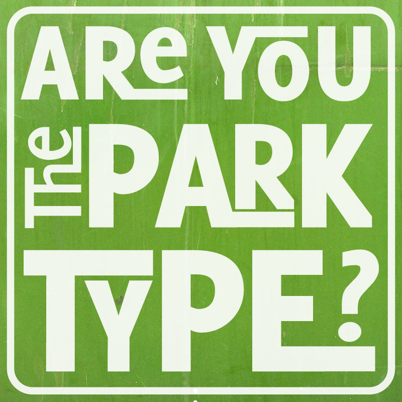
Navigating thousands of acres of city parks would be intimidating if not for good signage. New York City and Philadelphia have recently taken strides towards implementing cohesive programs of typography standards and wayfinding graphics throughout their parks.
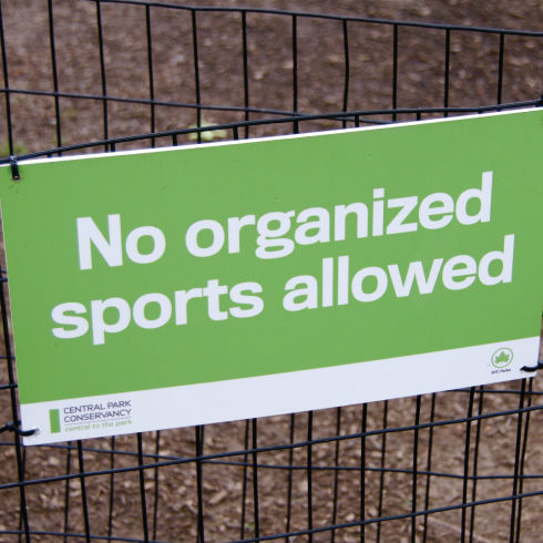
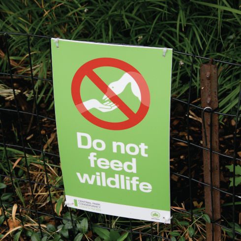
Unifying over 29,000 acres of land by updating their logo of an iconic green leaf, the New York Parks & Recreation Department added clarity to their signage and sparked the re-birth of their entire identity branding. The new standards elimante the hodge podge of signage, reduce clutter, and provide all necessary information in an easy-to-discern graphic orientation. Using Akkurat, the primary font of the new logo, instead of Times New Roman has improved legibility, while the sans serif font imparts a more relaxed feeling.
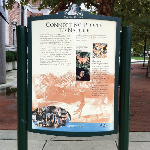
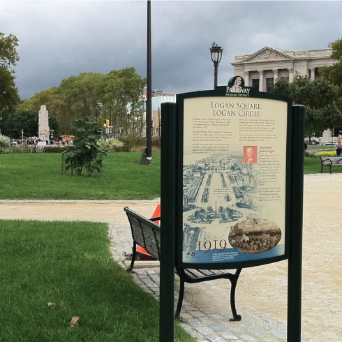
On the local front, the Fairmount Park Commission is introducing a new signage system for over 9,200 acres of space in Philadelphia. Similarly to NYC, the Fairmount system can be recognized immediately due to its consistent use of typography and symbols. The system serves to unify wayfinding and interpretive signage throughout historical areas of the city, as well as parks.
These two examples demonstrate just how effectively typography—when considered as a key component of signage systems—can create a sense of accessibility and consistency needed for proficient and unintimidating navigation.